The Art of the Absence: How Luxury Designers Are Using Darkness to Define the Modern Home
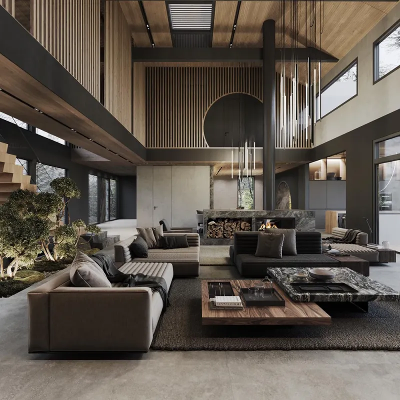
Photo: minimalist luxury interior dark moody lighting shadow architectural design, via img.designswan.com
There is a particular kind of room that stops you at the threshold. Not because it overwhelms with spectacle, but because it withholds just enough to make you lean forward. A single shaft of afternoon light crossing a polished concrete floor. A corridor that deepens into shadow before opening, unexpectedly, into brightness. A reading alcove where the illumination is warm and low and entirely its own world, separate from the airy volume beyond.
These are not accidents of design. They are its highest expression — and they represent a quiet but accelerating shift in how America's most thoughtfully conceived luxury interiors are being conceived and experienced.
The Tyranny of the Bright
For the better part of two decades, the aspirational American home has been defined by its relationship to light. Open plans dissolved the walls that once created intimacy. Glass expanded until facades became transparent membranes between inside and out. The message embedded in every architectural magazine spread, every new-construction listing, every staged model home was consistent and unambiguous: more light, more openness, more transparency.
The logic was not without merit. Natural light improves mood, expands perceived volume, and connects inhabitants to the rhythms of the exterior world. In the hands of a skilled architect, a luminous interior can feel genuinely transcendent.
But something has begun to shift. Among designers working at the intersection of luxury residential and wellness-focused architecture, there is a growing acknowledgment that the maximally bright interior carries its own psychological costs — and that the antidote is not more light management, but a genuine embrace of its absence.
"We have spent years training clients to want light," observes one New York-based interior designer whose recent projects have moved decisively toward what she calls 'tonal architecture.' "Now the most sophisticated clients are coming to us and saying they feel exposed. They feel like they cannot rest. The home that was supposed to feel expansive feels relentless."
What Circadian Science Is Telling Designers
The emerging field of circadian design — the practice of aligning architectural lighting with the body's natural hormonal rhythms — provides a scientific framework for what many designers have been intuiting for years. The human body is not designed for uniform illumination. It is calibrated to respond to a dynamic spectrum of light and darkness that shifts across the day and across the seasons, triggering hormonal responses that govern alertness, appetite, emotional regulation, and sleep.
Residences that maintain high levels of cool, blue-spectrum light throughout the evening — as many glass-forward, technology-integrated homes inadvertently do — suppress melatonin production and disrupt the sleep architecture that underlies long-term health. The consequences are not abstract. Sleep researchers at institutions including Harvard Medical School and the University of Colorado have documented measurable health impacts from chronic circadian disruption, impacts that are increasingly recognized as relevant to residential design decisions.
The luxury home market, which has already absorbed the language of wellness into its marketing vocabulary through features such as air purification, water filtration, and infrared saunas, is beginning to grapple with the implications. A home that looks spectacular in listing photography but undermines its inhabitants' sleep and hormonal balance is, by a meaningful definition, failing at its primary function.
Designers working with this framework are introducing what they describe as 'light zoning' — the deliberate calibration of illumination levels across different areas and times of day, using a combination of smart-tinting glass, layered artificial lighting, and architectural elements such as deep overhangs, interior screens, and opaque material breaks to create distinct experiential zones within a single residence.
The Biophilic Case for Shadow
Biophilic design — the practice of embedding natural patterns and references into built environments to support human wellbeing — has become one of the most discussed concepts in contemporary residential architecture. Its most visible applications involve the introduction of living plants, natural materials, water features, and organic forms into interior spaces.
Less frequently discussed, but equally supported by the underlying research, is the biophilic value of shadow itself. Natural environments are not uniformly illuminated. They are characterized by canopy, by dappled light, by the deep shade of forest interiors and the bright exposure of clearings — a dynamic contrast that human neurology evolved within and continues to find deeply regulating.
Interiors that replicate this contrast — that move a resident through zones of brightness and shadow, that use ceiling height, material opacity, and strategic openings to create spatial variety — engage the nervous system in ways that uniformly bright environments simply cannot. "The shadow is what gives the light its meaning," notes one Los Angeles-based architect whose residential work has been recognized for its integration of wellness principles. "Without the dark, you lose the ability to perceive the bright as anything other than ambient noise."
Materials That Refuse the Light
The design language of deliberate darkness is, by definition, a material language. It is expressed through the selection of surfaces that absorb rather than reflect, that deepen a space rather than amplifying it.
Blackened steel, smoked oak, honed black granite, and dark-stained concrete have all gained significant ground in high-end American interiors over the past several years — not as accent elements, but as primary surface treatments that establish the tonal register of an entire space. When deployed against a backdrop of controlled natural light, these materials create interiors of extraordinary psychological density: spaces that feel inhabited rather than staged, settled rather than performative.
Smart-tinting glass — the electrochromic technology increasingly standard in new luxury construction — plays a dual role in this context. It is most commonly discussed as a solar management tool, but its most compelling application may be as an instrument of spatial mood. The ability to shift a glass wall from fully transparent to deeply tinted within seconds allows a residence to transition between its extroverted and introverted states on demand, responding to the time of day, the weather, or simply the needs of the people inside it.
The Psychology of Threshold
Perhaps the most underappreciated argument for strategic darkness is architectural rather than scientific. It is the argument from contrast — the principle that spatial experiences derive their power not from any single quality, but from the dynamic relationship between opposing qualities.
A home that is uniformly light offers no threshold, no sense of arrival or departure between its spaces. A home that moves its inhabitants through a carefully orchestrated sequence of luminous and shadowed volumes creates a spatial narrative — one in which each room is experienced not in isolation, but in relation to what came before and what lies ahead.
This is, ultimately, the argument that the finest residential designers have always made. The minimalist interior is not an empty one. It is one in which every element — including the absence of light — is present for a reason, doing exactly the work it was placed there to do.
In a market saturated with the spectacular, that kind of quiet intentionality may be the most distinctive luxury of all.