The Compression Illusion: When Minimalist Luxury Homes Feel Smaller Than Their Floor Plans Promise
There is a particular discomfort that visits certain homeowners shortly after they move into a property they have spent years imagining. The square footage is unambiguous. The ceilings soar. The floor plan, when viewed on paper, communicates an almost theatrical generosity of space. And yet, standing at the center of a room that measures five thousand square feet, something feels unexpectedly — almost inexplicably — tight.
This is not a phenomenon born of poor architecture. Many of the homes in which it occurs were designed by celebrated firms, finished to standards that invite editorial coverage, and priced at figures that preclude any accusation of compromise. The compression these homeowners sense is not a failure of construction. It is, in a very precise sense, a failure of perception — one engineered, however unintentionally, by the very design philosophy that was meant to produce its opposite.
The Brain's Spatial Accounting System
Human beings do not experience space through measurement. They experience it through inference. The mind assembles a sense of scale by reading visual cues — the density of objects, the layering of surfaces, the relationship between furnishings and the walls that contain them — and constructs a working estimate of a room's dimensions from that assembled evidence.
Research in environmental psychology, particularly work conducted at institutions including the University of California and MIT's Senseable City Lab, has consistently demonstrated that spatial perception is heavily dependent on what designers call "reference anchoring." When a room contains multiple elements of known or intuited scale — a sofa, a side table, a piece of art hung at a familiar height — the brain triangulates the room's size against those anchors with reasonable accuracy. Remove those anchors, and the estimating mechanism falters.
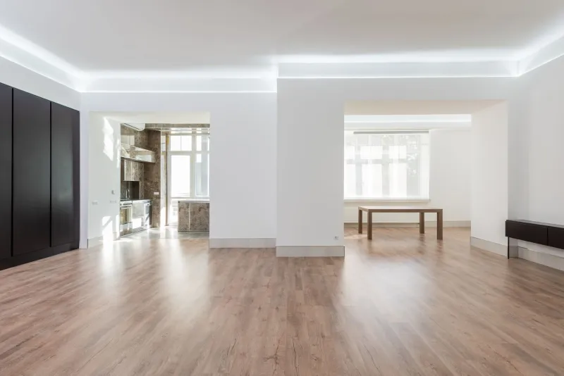
In a minimalist interior stripped of most furnishings, the brain loses its benchmarks. Without reference points, it defaults not to a generous interpretation of the available space but to a conservative one. The room, paradoxically, registers as smaller than it is.
The Partition Problem
The architectural doctrine of the open plan has been central to luxury residential design for the better part of three decades. The removal of interior walls — the merging of kitchen, dining, and living into a single uninterrupted volume — was conceived as a liberating gesture, a way of allowing space to breathe and light to travel unimpeded across a floor plate.
In practice, however, the unpartitioned room presents its own perceptual complications. Interior designers working at the upper end of the market have noted, with increasing frequency, that clients commissioning large open-plan renovations often report feeling less at ease in the finished space than they anticipated. The issue, several practitioners suggest, is not the size of the volume but its legibility.
"The human nervous system finds comfort in zones," explains one New York-based designer whose portfolio spans residences from the Hamptons to Aspen. "When a room has no implied boundaries — no change in ceiling height, no shift in flooring, no furniture grouping that signals 'this is where we eat' and 'this is where we rest' — people feel adrift rather than liberated. The space stops feeling large and starts feeling undefined, which the brain interprets as unsettling rather than expansive."
Undefinedness, it turns out, reads as smallness.
The Material Monochrome
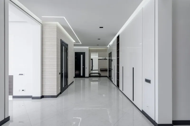
Color and material variation perform a spatial function that is rarely acknowledged in the discourse surrounding minimalist design. When a room employs a single material palette — white plaster walls meeting white oak floors meeting white lacquer cabinetry — the eye has nowhere to rest and no distance to measure. The visual field flattens. Depth recedes.
This phenomenon is well understood in theatrical lighting design and in the psychology of visual art, where the compression of tonal range is used deliberately to create a sense of intimacy or claustrophobia. In residential architecture, however, it frequently arrives as an unintended consequence of the commitment to restraint.
Several prominent architects working in glass-forward, minimalist residential design have begun incorporating what they describe as "tonal punctuation" — a deliberate introduction of material contrast at strategic intervals — precisely to counteract this effect. A darkened steel element at the base of a staircase. A single wall of honed limestone in a field of plaster. Not decoration for its own sake, but spatial calibration: giving the eye a landmark against which to measure the room's true extent.
Furniture Density as Spatial Amplifier
There is a counterintuitive truth that experienced interior designers often share with clients reluctant to populate their minimalist homes: thoughtfully placed furniture does not make a room feel smaller. It makes it feel larger.
The mechanism is straightforward. A well-proportioned sofa in the center of a generous living room gives the eye a scale reference. The distance between that sofa and the far wall becomes measurable, comprehensible, and therefore impressive. Without the sofa, the far wall simply exists — its distance from the viewer neither registered nor appreciated.
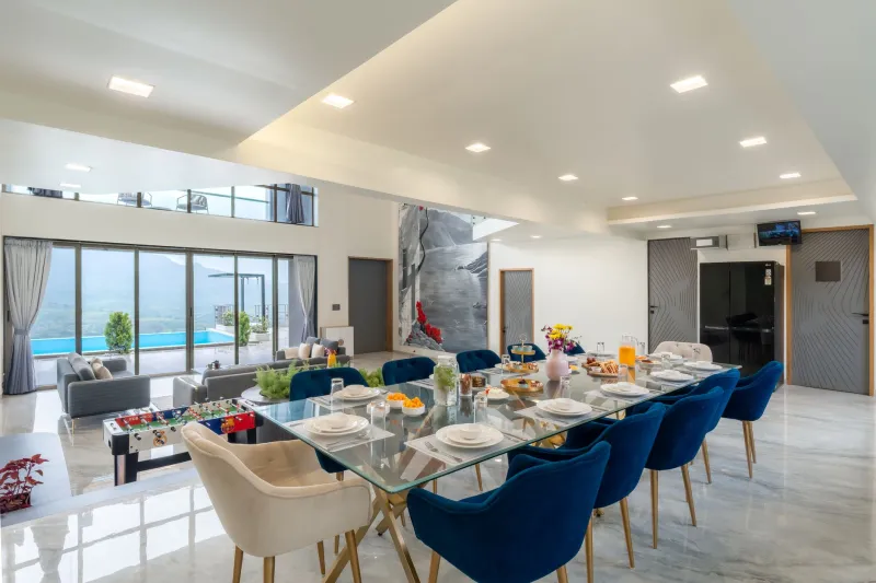
This is the principle behind what some designers call "deliberate density" — the strategic introduction of furnishings not to fill a room but to reveal it. The goal is not abundance. It is calibration. A single, large-scale piece of furniture, placed with precision, can communicate more spatial generosity than an entirely empty room of identical dimensions.
"I had a client in Los Angeles who kept removing things," recalls one designer with projects across California and the Pacific Northwest. "Every time I added a piece, she'd ask me to take it out. By the time she moved in, the room was essentially bare. She called me two weeks later and said it felt like a parking structure. We put three pieces back in. The room suddenly felt enormous."
The Scale of Absence
There is, it should be noted, a version of minimalist luxury design that achieves genuine spatial grandeur through reduction. It exists. It is, however, rarer than the design press suggests, and it typically depends on conditions that are difficult to replicate: exceptional natural light, carefully modulated ceiling heights, exterior views that extend the perceived interior volume into the landscape beyond the glass.
When those conditions are present, the minimalist interior can achieve something remarkable — a sense of infinite extension, of space dissolving into light and air. When they are absent, or when the reduction is applied without sufficient architectural compensation, the result is the compression illusion: a home that measures large and feels small.
The lesson for homeowners, architects, and designers operating in this space is not that minimalism fails. It is that minimalism, practiced without a precise understanding of how the human perceptual system reads space, can produce outcomes that contradict its own ambitions. Less, in the wrong hands, does not feel like more. It feels like less — and sometimes, with disquieting accuracy, like considerably less than what the floor plan promised.
For those commissioning or inhabiting spaces at the intersection of scale and restraint, the question is no longer simply how much to remove. It is how much to leave — and where, and why.